
Signs serve a vital purpose in our parks and our facilities. Often, signs are the first thing that welcomes visitors and are present throughout the whole user experience.
Signs direct, instruct, educate, and protect the people that enter your assets.
Carefully selecting the materials and design helps the signs display their messages better and longer.
If you’re adding signs to a new facility or replacing existing ones, here are some things to consider for the most effective signs.
Creating Effective Signs
Here are some things to consider during the sign creation process.
Choosing Materials
You want your signs to serve their purpose for as long as possible. When choosing the best sign material, you need to determine the signs purpose, placement, and the potential conditions it will encounter.
Here are some of the more common materials you could choose for signs:
- Aluminum/Aluminum Composite: A relatively inexpensive option that won’t corrode.
- Acrylic and Plexiglass: Provide a distinctive stained glass appearance that works well with lighted cabinet signs.
- Medium Density Overlay: This option gives the option of using wood, but the resin overlay makes it more weather resistant.
- Treated Wood: Pressure-treated wood gives that natural, rustic look and gets added protection from simple poly coatings.
- Durawood: Looks and feels like wood, but it’s made of vinyl for less cost and maintenance.
- Vinyl: A better choice for temporary signs--like special events--with this affordable but less durable material.
- Coroplast: Corrugated plastic is lighter and less expensive than solid plastic, which can be great for promotional or special event signs.
Color Combinations
Using contrasting backgrounds and lettering makes your sign more visible and easily readable.
Here are the top 5 most readable color combinations:
- Black on Yellow
- Black on White
- Yellow on Black
- White on Blue
- Green on White
These are only some usable combinations. They may be the best options, especially in outdoor settings.
Stay Positive
People don’t like being told what they can’t do. And yes, there are times when signs need to tell people not to do something for their safety. Like “No Trespassing” or “No Smoking.”
But there are other times when signs could convey their message with a softer approach. Here are a few examples:
- No Fishing → Only the Birds May Fish Here
- No Picking Flowers → Others Want to Enjoy the Flowers. Please Keep Them Here.
- No Ball Playing → Please Use Our Athletic Fields at the South End of the Park
- No Yelling → Help Us Keep this Area Quiet and Peaceful
You still want to send a clear message that’s as concise as possible. But opt for covey it with positivity when it works.
Make Signs Inclusive
We want as many people as possible to feel welcome at our parks and facilities. Our signs can be one way that helps everyone feel welcome.
Understanding who visits your facilities allows you to create signs that make everyone feel included. Inclusive signs can include wording in different languages, braille, or Picture Communication Symbols for children with special needs.
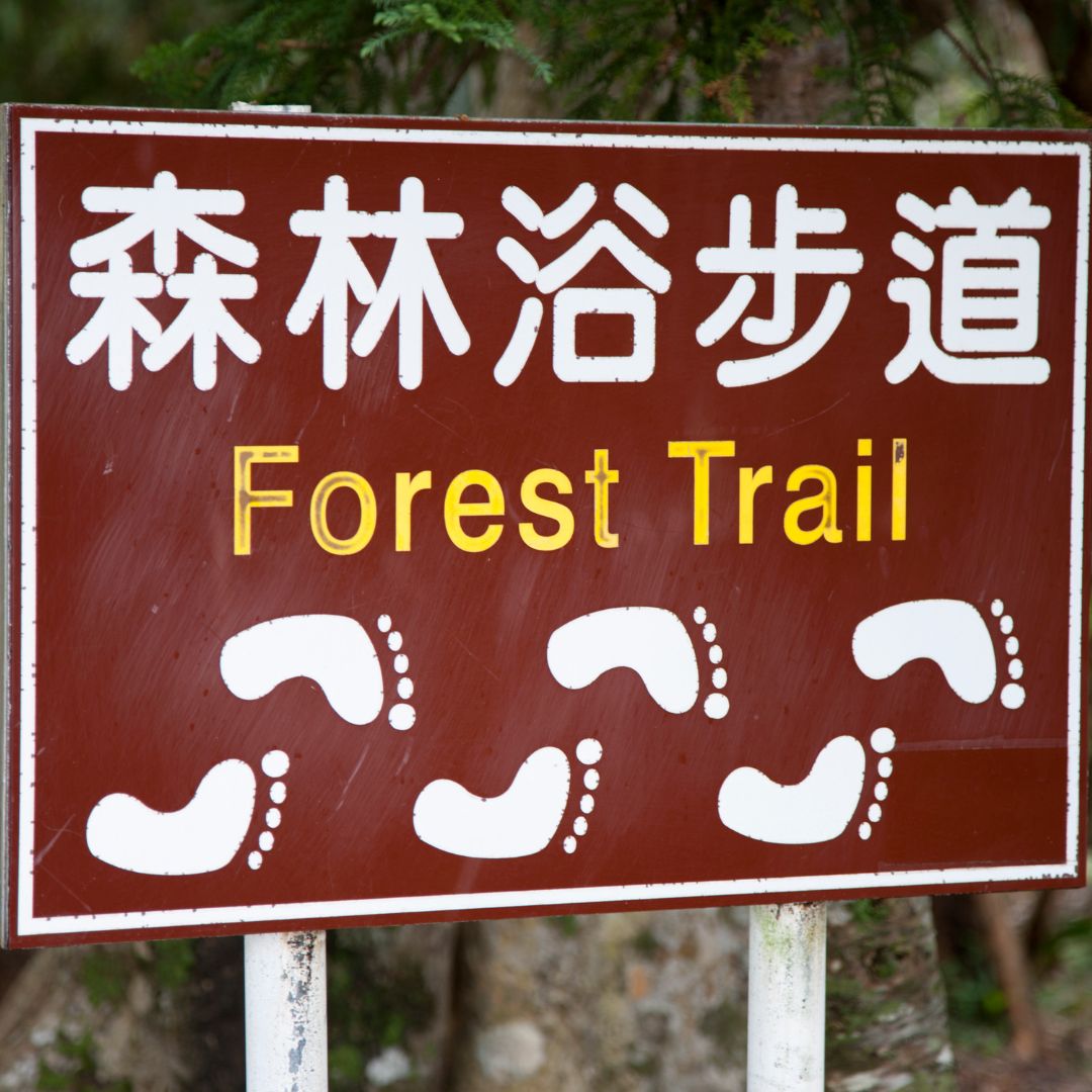
Use Recognizable Symbols
Another way to make signs easily understandable and inclusive is by using common symbols. Just about everyone knows the symbols for restrooms, no smoking, stop, etc.
An easily recognizable symbol can convey a message with less space. And, when you think about it, there’s only so much you can fit on a sign.
Avoid ALL CAPS
Consider Skipping ALL CAPITAL LETTERS on your signs. It may seem like ALL CAPS is easier for visitors to read. Research has shown, however, text with both upper and lower case letters is more legible from a distance.
If you want to use CAPS, only use it on words that need extra emphasis.
3-30-3 Rule for Interpretive Signs
Visitors interact with signs differently. Some will only spend a few seconds looking at a sign--no matter what effort was put into it. Others don’t mind spending a little extra time learning from an interpretive panel or historical marker.
The most effective informational signs provide a learning opportunity for quick scanners, slow absorbers, and anyone in between.
Provide something that could be gained by visitors who spend 3 seconds, 30 seconds, and 3 minutes at an interpretative panel. For example, a compelling heading about an area will catch the eye of those quick scanners. A fun fact set off from the other text will interest those looking at the sign for 30 seconds.
Give clear and compelling information for those taking in the whole sign. But remember, you’re not writing a novel. Limit the sign type to 250 words or less--after all, there are other things to see at your assets. For some signs, less is more.
The Takeaway
Signs often serve as the initial point of contact and guide users through their experience. Signs that are clear, concise, and aesthetically pleasing add to the user experience.
Choosing suitable materials, thoughtful placement, and clear design can take some planning. When done well, however, the signs will be an essential fixture of your assets for years.
In the next article, we will discuss how to maintain those signs and minimize the effects of graffiti.